December 24th, 2013
Updated with the latest and greatest Zepto.js… Let it snow!
If you’re interested how this works, grab the source. Except for Zepto.js (built with detect & fx support) there’s no external dependencies (not counting the Twitter and analytics).
Happy Holidays!
P.S. Because it was so popular, I’ve started another flash sale of my ebook Retinafy your web sites and app—use coupon “hiresholidays” for 15% off, but only on December 24th and 25th!
December 6th, 2013
This holiday season, delight your users with pixel-perfect deliciously retinafied web sites and apps—my book Retinafy your web sites and apps is ON SALE, but just this weekend (December 6 through 8).

Use coupon code highresholidays on checkout for $15 off the regular price! 🙂
Get it for yourself or a beloved designer or developer!
December 5th, 2013
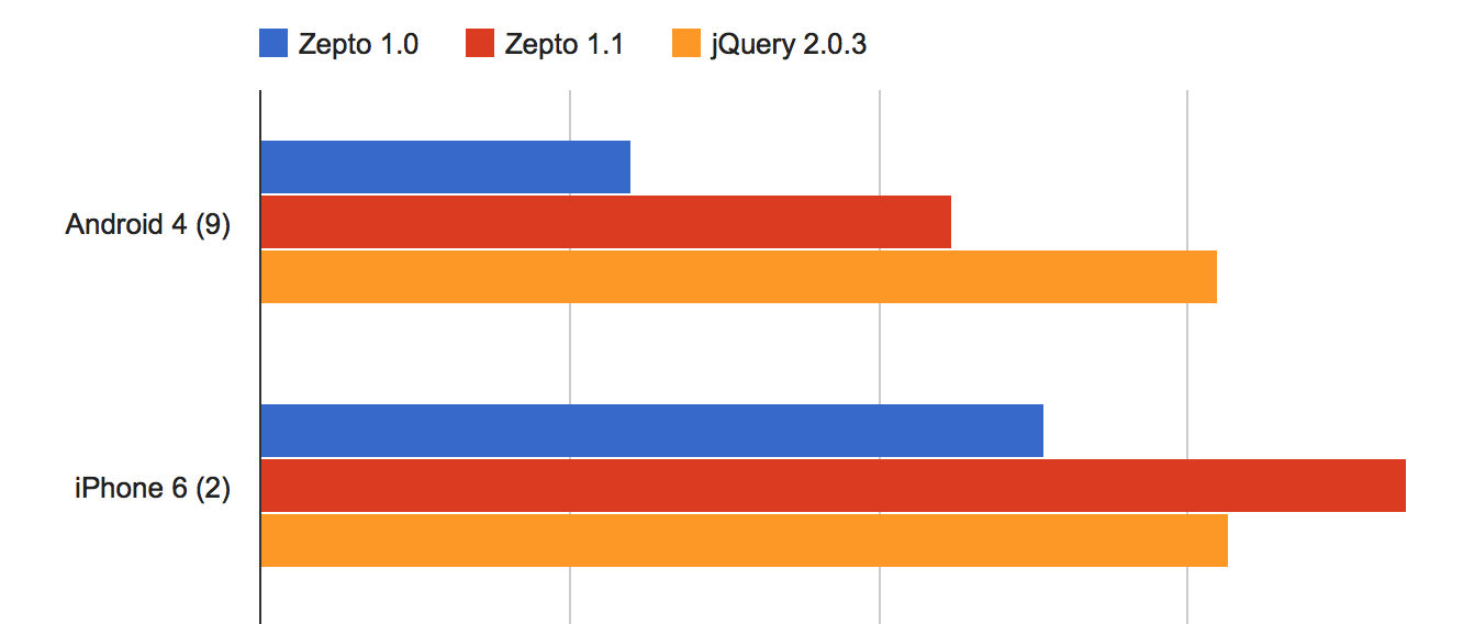
Mislav and I just released Zepto 1.1, which brings updates across the board. Even if you don’t need to new features, upgrading is worth it for “free” IE 10 support (which makes mobile sites work great on Windows Phone 8) as well as the huge performance speedups for common operations (benchmarks).
Notable changes
- IE10+ support
-
Huge speed optimizations for simple CSS selectors (classname, ID) and DOM element creation
- Provide
$.Callbacks and $.Deferred in optional modules
- Removed
fx and detect modules from default build
Ajax
- New supported
$.ajax() options:
xhrFieldsmimeTypejsonpCallback-
username & password
- Promise interface supported when loading the optional “callbacks” and “deferred” modules:
xhr.done(function(data, status, xhr){ ... })xhr.fail(function(xhr, errorType, error){ ... })xhr.always(function(){ ... })
- Enable mutating Ajax settings in the
beforeSend callback
- Fix JSONP callbacks for errored responses on Android
- Ensure consistent
Accept request HTTP header across browsers
- Fix
$.param() for jQuery compatibility when handling complex nested objects
- Support IIS JavaScript MIME type
- Pass “abort” and “timeout” status to global
ajaxError event handlers
Event
- Provide
isDefaultPrevented(), stopImmediatePropagation(), and related methods for all events
- Support the
data argument in .bind(), .on(), and .one()
- Support CSS selector argument in
.one() for event delegation
- Support
.on('ready') as an alias for .ready()
- Enable event handlers on plain old JS objects
- Many fixes related to event delegation
Data
- Cleanup
.data() values on DOM element removal with .remove/empty()
-
.data() now assumes that numbers that begin with zeroes are strings
-
.removeData() (no argument) now removes all data on the element
- Enable reading
data-* attributes that have underscores in the name
Other updates
- Support simple DOM property names in
.prop(name) such as for, class, readonly…
- Implement the
.scrollLeft([value]) method
- Support setting
.scrollTop(value)
- Fix
$(document).width/height()
- Support fetching multiple CSS values via array in
.css(['prop1', 'prop2', ...])
- Support setting CSS transition delay via
delay option for .animate()
- Ensure that
.animate() callback always fires
All in all, our most bestest release yet. A big thank-you to all our contributors for making this awesome! 🙂
December 3rd, 2013
1. You’re more likely to get what you want.
2. You’re more likely to get what you want.
3. You’re more likely to get what you want.
4. You’re more likely to get what you want.
5. You’re more likely to get what you want.
6. You’re more likely to get what you want.
7. You’re more likely to get what you want.
8. You’re more likely to get what you want.
9. You’re more likely to get what you want.
10. You’re more likely to get what you want.
November 27th, 2013

Freckle Time Tracking is turning five on December 1. In 5 years of being a co-founder of Freckle I’ve learned a lot of things, but here are 5 important takeaways. Maybe it helps you on your path to product nirvana:
1. You’re not a “tech company”—you’re a “make customers awesome” company
People don’t pay you because you have amazing programming skills and can write nginx configurations blindfolded. People pay you money because the product you sell to them saves them time, money, effort and nerves. It’s your job to make your customer more awesome. Every decision you make for your product and business should revolve around that.
2. Never promise dates for a feature launch
Just don’t promise launch dates for a feature. Ever. Trust me on this. People will ask you all the time when “feature X” is ready. A good way to answer that question is (if you plan on doing it), “We’re considering this feature for a future version. I can’t give you a date on when it will be ready.”. Just be honest to your customers—you don’t know yourself if and when a feature will really be ready.
3. Spend money on things that help you stay productive
This includes obvious stuff like a laptop that doesn’t suck (upgrade often), a good working chair and desk, and less obvious things like software that allows you to concentrate on developing your application’s features rather than configuring servers.
4. Do not work too much
Overworking yourself is the first step to failure in business. You can’t do your best if you’re permanently stressed out. Don’t check email in the evenings. If you’re only 1 or 2 people, don’t provide 24/7 support. It’s ok. Customers understand. It helps to not have a mission-critical product (if Time Tracking goes down it’s annoying but people can take a note on paper).
You didn’t start a company to die of exhaustion. Your health, family and social life is more important than 5 minute support response times and a 100% uptime guarantee.
By the way, one way to keep on top of this is to keep track on how you spend your time.
5. Don’t believe the hype
People are good at getting excited. And people are good at believing the hype™ about new technologies, frameworks, programming languages and ways to deploy. People will tell you what to do and what to plan for. That you need to scale to millions of users, and you’re doomed if you don’t plan for that. That generating HTML on the server is so 1994. That node.js will cure cancer.
The fact is that you need to be pragmatic—your goal is to run a business. Use technology that is proven (to you), and that you know how to work with. My “litmus test” for technology is if the people that provide it are in a similar situation as you are: having to rely on it to run their own business (this quickly weeds out cool-but-academic-only stuff). You need to optimize for shipping. That includes writing less code, having broad test coverage, and concentrate on getting things out in order of long-term profitability for your business.
Good luck with your business! 🙂
November 18th, 2013
You’re using the hottest and hippest new framework? You generate Node-powered Erlang templates in a crowdsourced Haskell cluster? You run JavaScript on a Ruby VM that uses a Lisp DSL? You stream events to your MVVC like there’s no tomorrow?
Whatever you do, in a real business, all of these things are unlikely to help you to launch features faster.
Adding a new feature encompasses a lot more than just sitting down and writing some code:
- First you need to figure out what the feature is…
- …then you need to make sure you define what it isn’t.
- You need to make sure that it will make your customers awesomer.
- You need to think long and hard about if it’s a good fit for your product.
- You need to design how it works, in detail. (Don’t forget those pesky edge cases!)
- You might need to research if it’s technologically feasible.
- You need to decide if it’s worth the maintenance and support cost.
- If it needs a user interface, you need to design that as well.
- You want it to work on phones as well, right?
- You need to write tests to make sure it doesn’t break anything else.
- You might need to deploy it in off-hours to minimize disruption to customers. Everybody on the team loves to stay up all night!
- You may need to adapt your infrastructure and add new hardware and software, which needs to be bought or rented, managed and monitored.
- You need to write new documentation. (Hopefully not in multiple languages.)
- You need to update your marketing.
- You might need to update your onboarding process.
- You need to tell your customers about the feature, and not just once.
- You might want to add a tutorial for the new feature.
- You need to track adoption of the feature and spend time to decide if you need to change anything. If you do, you might have to run through all of the previous bullet points again.
- The feature
might will make future features more complex.
The gist is that programming and technological choices really only play a minor part in all of this. Our old friend, the 80/20 rule applies here: It’s 80% all of the above stuff and 20% implementation.
IMHO, the real strength of a good framework lies in how easy it is to support an application in the long run. I suggest that your choice of technology is based on how you can minimize friction and extra work, as well as how likely it is that it is still around a few years form now.
For web applications, choose something that has good defaults, is easy to test and is playing to the strength of servers (DB queries, HTML generation) and clients (showing HTML, UI interactivity) and minimizes the amount of code you have to write.
For any sort of application, always, always go for something that the people creating and maintaining it use in their own, paid-for products. Avoid anything that solves “potential problems” that aren’t actual real problems like the plague.
Pragmatic, real-world solutions beat oh-so-clean-we’ve-everything-in-layers-hypermedia-blah-blah-blah any day. Personally, my winner clearly is Rails, but YMMV. Heck, I even use PHP in some projects where a larger framework would just get in the way.
But don’t think the latest insert-buzzword-here framework will solve all your woes—it won’t.
October 24th, 2013
The launch of iOS 7 a month ago, like it or not, has been quite successful with apparently about 2/3 of iOS users now on the latest operating system from Apple.
As you might have heard, web apps were severely broken on iOS 7—a huge step backwards over the stability and feature support in iOS 6. A few of the more grave bugs have now been fixed in 7.0.3.
Note that these bugs only affected saved-to-homescreen web sites that have the “apple-mobile-web-app-capable” meta tag enabled.
alert() and confirm() now work again- External URLs work (
target="xxx")
- mailto:, tel: and other special URL schemes work*. You can now open a Mail.app compose window from within your web.
Some issues remain and hopefully get fixed in a future release, such as a problem that overwrites existing home screen web apps (until a Spingboard restart), bad performance on initially load, and disappearing screens from the task manager.
I haven’t tested startup images, which where also quite broken. If I get around to that, I’ll do that as well.
*Note that you can’t test mailto: with the iOS Simulator, as there’s no Mail.app installed on it. You’ll need to use a real device.
A special note to Apple: please, for the love of science, include a changelog for Mobile Safari and Mobile Web Apps in your release notes, or have it around somewhere else. It’s horrible to have to guess and being not sure about what’s actually being fixed or not. Why not share bug reports publicly for this, at least for registered developers? We’re not in the dark ages of software development anymore. Thanks for listening!
October 10th, 2013
This is part 2 of a 3-part mini-series on designing iOS 7 web apps:
In part 1 of this series you learned some tricks about styling your application—but what about user interaction?
Animation
All the buzz about “reduced” or “flat” styling in iOS 7 is taking the spotlight away from an other major change, more “physical” animations:
People are accustomed to the subtle animation used in the built-in iOS apps. In fact, people tend to regard the smooth transitions between views, the fluid response to changes in device orientation, and the physics-based scrolling as an expected part of the iOS experience. Unless you’re creating an app that enables an immersive experience—such as a game—custom animation should be comparable to the built-in animations. — iOS Human Interface Guidelines
There’s a few important transition animations that come practically for free for native applications, but take a bit of tinkering if you want to recreate these in a web app:
- “Show panel” animation, when you drill down from a list, or when you show settings
- “Show modal panel” animation, an animation showing a modal panel scrolling up from the bottom of the screen
- The controversial physics-simulating rubber-band bouncing scrolling like in the Messages application
 An easy way to analyze animations is to use the iOS Simulator (which comes along Xcode) and a tool to take screen videos. Be sure to export in a lossless format and you’re now able to inspect the animations in detail (I use Final Cut Pro because it makes it easy to step between frames and add markers to get timings, but anything that has a step-by-step frame advance and a timestamp works).
On the left you can see the panel animation when drilling down in a list, which is the same animation I wanted for our mobile web version of Freckle Time Tracking.
Next to the duration of the animation, the easing equation (or in CSS parlance, the “timing function”) is the most important component of an animation. You don’t just move things, you move things with acceleration and deceleration (just like in the real world, here come physics again!). I’ve used Stylie’s Motion tab to design a timing function that’s close to what Apple uses on iOS 7.
If you do a step-by-step analysis of the panel animation, you can see that not only the new panel slides in from the right, but the old panel is sliding 50% to the left while getting less opaque, with a gray background behind it. The text in the navigation bar does some cross-fading as well—it’s actually a quite complex animation.
Caveat: you can only focus form fields as a direct result of a user interaction, like on a click or touchend event. This means that if you want your forms to animate in, you can’t focus a form field via code and users will have to tap the form field they want to edit. This can be fine with editing forms, but with “new” forms you’ll likely want to forego the animation and opt for focusing instead.
Here’s the final animation JavaScript code, using Zepto:
Home-screen web apps
The final thing that takes a web app closer to being just like a native app is being able to run full-screen, a thing that has been possible for quite a while now on iOS by saving to the home screen. Just like in previous iOS versions, this is possible in iOS 7 as well. Please note that there are several horrendous bugs in the current incarnation of iOS 7 (like no alert() or confirm() modals, mailto: not working and other issues).
Nevertheless, two small tips with this:
Set the
apple-mobile-web-app-status-bar-style meta tag’s content to
black-translucent to get a fully translucent phone status bar. You can add a class to your
body element to indicate that your application is running from the home screen (
if (navigator.standalone) $('#body').addClass('standalone')). When that class is active, add the necessary padding to the top of your page.
Switch to a high resolution (1024×1024) touch icon and rely on apple-touch-icon to provide a correct icon for iOS 6 (with the gloss) and 7. Note that the border radius has changed, I’d suggest to try not to bother to be too clever and let the OS do the job of cutting the icon to the right shape.
Offline?
There’s a hype about designing “offline first”, which I think is a load of crap. These are phones people use, and they’re almost always online, and it will certainly not get worse in the future. I assume an always-on connection, but just in case the connection goes down I show a warning message (that people can easily dismiss, if they choose to).
It’s as easy as…
…where online and offline are functions that hide or show your offline message.
That’s it for getting your web app closer to iOS 7 behavior—next time I’ll take a look at making cross-device compatible web apps, that load fast, work (almost) everywhere and don’t completely crap out on older devices. Stay tuned!
Please sign up for my newsletter to get this article series (and my other posts) delivered directly into your inbox (plus you’ll get a cool rebate coupon for my ebook
“Retinafy your web sites and web apps”!):
October 3rd, 2013
Mobile web apps just got even cooler, with Chrome for Android adding support for full-screen, saved to home screen web apps, making them first-class app citizens like on iOS.
Read about how to implement this on Google’s Developer Docs.
September 16th, 2013
This is part 1 of a 3-part mini-series on designing iOS 7 web apps:
So you want to create a mobile web app that doesn’t look like it’s from 2007 and loads fast to boot with, ideally looking and working just like a native app.
Now you might heave heard that Facebook famously switched to a native app citing performance concerns. However, you’re probably not Facebook and pushing terabytes of data around—most mobile apps just display some data and provide a way to input data (mostly just text) and that’s about it. Web apps do a great job, and you don’t have to develop a native app for each platform you want to support. Plus, you get to use skills you already have.
There’s three main areas that making a “native-like” mobile web app can be broken down to:
- Styling, specifically typography, hairlines, transparencies and animations
- Behavior, including saving the web app to the home screen, making the status bar “part” of the app and reacting to on/offline events, and fast-loading
- Cross-device compatibility, so the app runs on Android and other devices as well
In this first part of a mini-series I’ll go into some details about styling. I’ll use our new mobile web app for Freckle Time Tracking to demonstrate (if you’re a Freckle user: it’s in closed beta right now, ETA very soon!).
It’s all Retina, baby!
iOS7 no longer supports any (iPhone/iPod-sized) devices without a Retina screen and a lot of the design changes are informed by that. Thinner fonts, hairlines and so on are easy enough to do in native apps, but can be hard to do in web apps.
Fonts
iOS7 uses several different new fonts, and you can choose to support “Dynamic Type”, the new system-wide text size setting. Please be aware of the difference between the font: shorthand setting and the font-family: CSS properties, you’ll need to follow these rules exactly:
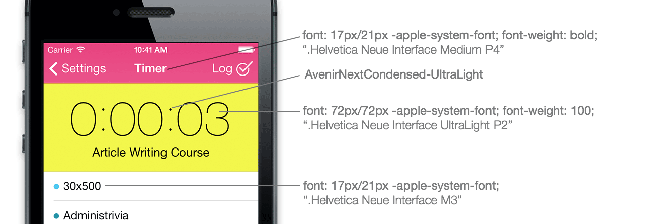
-
For text in lists and basically any normal text use “font-family: -apple-system-font;” (internally refers to ‘.Helvetica Neue Interface M3’¹) and, if you don’t want to participate in Dynamic Text (see below) force set size 17px and line-height 21px.
- Headers in navigation bars use “font-family: -apple-system-font” with font-weight: bold (internally ‘.Helvetica Neue Interface Medium P4’) at the same size and line-height.
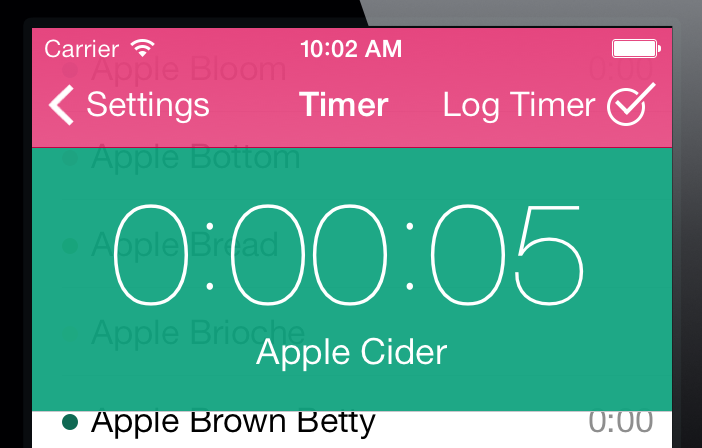
-
Very large text, like the one shown here in Freckle’s Timer panel uses “font-family: -apple-system-font” with font-weight: 100 (internally ‘.Helvetica Neue Interface UltraLight P2’) at 72px size. The round colon characters are actually part of a different new font that comes with iOS7, “AvenirNextCondensed-UltraLight” (size 70px).
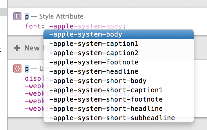
You can also tap into the new system-wide font scaling setting (Dynamic Text) for better accessibility, with various other -apple-system CSS presets.
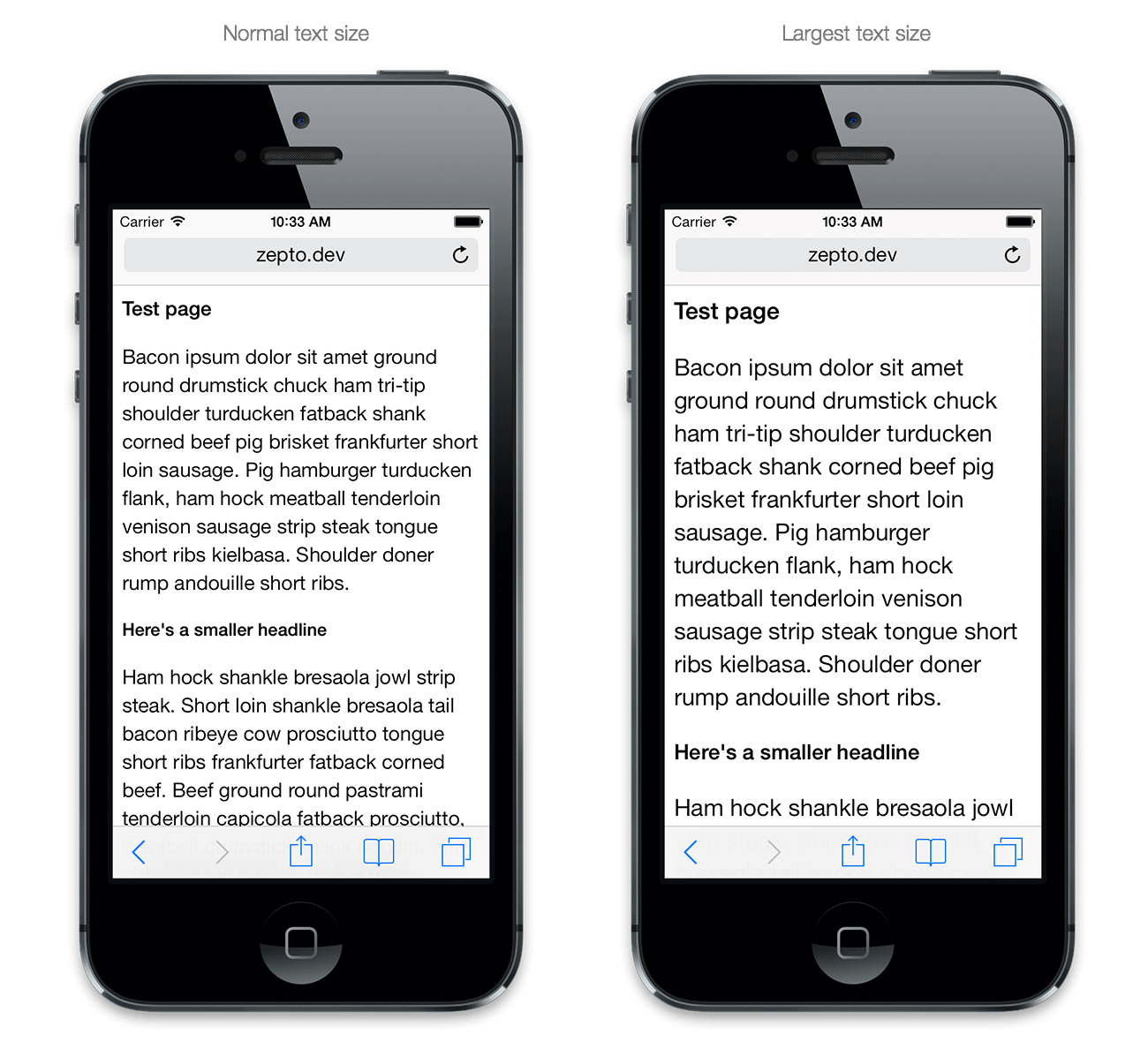
The most important presets are -apple-system-headline, -apple-system-subheadline and -apple-system-body. Different from -apple-system-font, all of the above presets set not only the font family but also other properties like size and line-height; and must be used with the font: shorthand CSS property.
Caveat: Using -apple-system-font can yield slightly different results (and not the exact same font) as compared to the -apple-system-* presets.² In most cases, it’s probably better to use the presets (and keep usage of -apple-system-font to a minimum). Don’t forget to set font-size and line-height if you can’t or don’t want to support Dynamic Text.
You can see all presets by attaching the to the iOS Simulator or a test device with Safari’s Web Inspector (you need Safari 6.1 beta, OS X Mavericks or a WebKit nightly!) and use the autocompleter to see all the options you have:
(The system wide text size setting doesn’t affect navigation bars or the really large text that’s shown in the clock application. If you’re looking to emulate these UI elements, use font-family: -apple-system-font and set the font size manually.)
Hairlines
CSS just pixel-doubles border lines on Retina screens, and doesn’t provide an easy way to do a 1 physical pixel wide hairline.
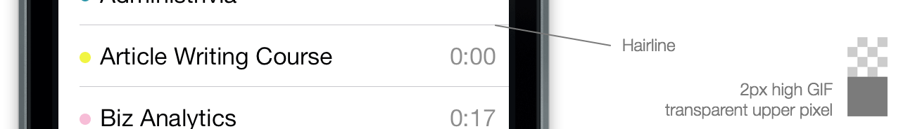
CSS borders can’t just be “0.5px” high (the CSS px unit requires integers, and DOM elements always are positioned on integer-based coordinates as well). One workaround are scaled CSS background images.
In the following example the data URL contains a 2px high PNG image that has a transparent upper pixel, and the pixel in the color I want the hairline to be as the lower pixel. An other way, which has the advantage of allowing you to easily customize the color but is slightly more verbose, is using SVG:
Transparencies and blurs
Using blurs should be limited to very few occasions since it’s a major performance hog—you can’t have any surfaces that blur out the background layers and still expect scrolling to be smooth for example. But it’s useful for example when you want to show an important message in a modal dialog but want to be able to hide it again when an event occurs (which normal alert dialogs can’t do).
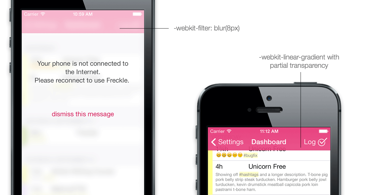
Blurs can done by setting a -webkit-filter: blur(8px) on all content and navigation elements, and overlaying an element with a transparent background and no blur.
For partial transparencies in navigation bars, just do gradients that have some transparency on one end and are full opaque on the other. When you know the height of an element, as is the case with iOS-style navigation bars, you can also include the hairline in the gradient, saving you from overlaying multiple backgrounds. Here’s the CSS gradient used for the pink gradient in the navigation bar:
In the next installment of this series, I’ll take a look into animations.
¹Apple recommends against using the internal names, which while they do work in iOS 7.0, are subject to change in future iOS versions.
²I don’t have specific examples but this is information from a reliable source, which I can’t name.
Please sign up for my newsletter to get this article series (and my other posts) delivered directly into your inbox (plus you’ll get a cool rebate coupon for my ebook
“Retinafy your web sites and web apps”!):


