
How to create a web app that looks like a iOS 7 native app (Part 2: Behavior)
October 10th, 2013- Part 1: Styling
- Part 2: Behavior
- Part 3: Cross-device compatibility (coming soon)
In part 1 of this series you learned some tricks about styling your application—but what about user interaction?
Animation
All the buzz about “reduced” or “flat” styling in iOS 7 is taking the spotlight away from an other major change, more “physical” animations:
People are accustomed to the subtle animation used in the built-in iOS apps. In fact, people tend to regard the smooth transitions between views, the fluid response to changes in device orientation, and the physics-based scrolling as an expected part of the iOS experience. Unless you’re creating an app that enables an immersive experience—such as a game—custom animation should be comparable to the built-in animations. — iOS Human Interface Guidelines
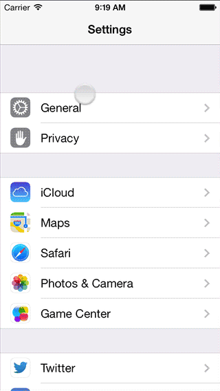
There’s a few important transition animations that come practically for free for native applications, but take a bit of tinkering if you want to recreate these in a web app:
- “Show panel” animation, when you drill down from a list, or when you show settings
- “Show modal panel” animation, an animation showing a modal panel scrolling up from the bottom of the screen
- The controversial physics-simulating rubber-band bouncing scrolling like in the Messages application
 An easy way to analyze animations is to use the iOS Simulator (which comes along Xcode) and a tool to take screen videos. Be sure to export in a lossless format and you’re now able to inspect the animations in detail (I use Final Cut Pro because it makes it easy to step between frames and add markers to get timings, but anything that has a step-by-step frame advance and a timestamp works).
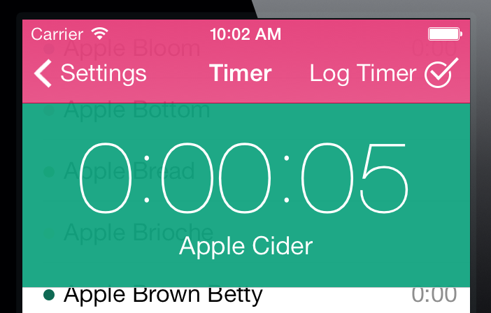
On the left you can see the panel animation when drilling down in a list, which is the same animation I wanted for our mobile web version of Freckle Time Tracking.
Next to the duration of the animation, the easing equation (or in CSS parlance, the “timing function”) is the most important component of an animation. You don’t just move things, you move things with acceleration and deceleration (just like in the real world, here come physics again!). I’ve used Stylie’s Motion tab to design a timing function that’s close to what Apple uses on iOS 7.
If you do a step-by-step analysis of the panel animation, you can see that not only the new panel slides in from the right, but the old panel is sliding 50% to the left while getting less opaque, with a gray background behind it. The text in the navigation bar does some cross-fading as well—it’s actually a quite complex animation.
Caveat: you can only focus form fields as a direct result of a user interaction, like on a click or touchend event. This means that if you want your forms to animate in, you can’t focus a form field via code and users will have to tap the form field they want to edit. This can be fine with editing forms, but with “new” forms you’ll likely want to forego the animation and opt for focusing instead.
Here’s the final animation JavaScript code, using Zepto:
Home-screen web apps
The final thing that takes a web app closer to being just like a native app is being able to run full-screen, a thing that has been possible for quite a while now on iOS by saving to the home screen. Just like in previous iOS versions, this is possible in iOS 7 as well. Please note that there are several horrendous bugs in the current incarnation of iOS 7 (like no alert() or confirm() modals, mailto: not working and other issues).
Nevertheless, two small tips with this:
Set the
apple-mobile-web-app-status-bar-style meta tag’s content to black-translucent to get a fully translucent phone status bar. You can add a class to your body element to indicate that your application is running from the home screen (if (navigator.standalone) $('#body').addClass('standalone')). When that class is active, add the necessary padding to the top of your page.
Switch to a high resolution (1024×1024) touch icon and rely on apple-touch-icon to provide a correct icon for iOS 6 (with the gloss) and 7. Note that the border radius has changed, I’d suggest to try not to bother to be too clever and let the OS do the job of cutting the icon to the right shape.
Offline?
There’s a hype about designing “offline first”, which I think is a load of crap. These are phones people use, and they’re almost always online, and it will certainly not get worse in the future. I assume an always-on connection, but just in case the connection goes down I show a warning message (that people can easily dismiss, if they choose to).
It’s as easy as…
…where online and offline are functions that hide or show your offline message.
That’s it for getting your web app closer to iOS 7 behavior—next time I’ll take a look at making cross-device compatible web apps, that load fast, work (almost) everywhere and don’t completely crap out on older devices. Stay tuned!


