February 23rd, 2013
OS X is awesome and that’s why we (neckbeard-less?) developers love it. Of course not everything is perfect, and one area of contention is the menu bar. There tends to be a never-ending supply of icons that fill it up and destroy its usefulness due to information overload.
There’s even tools that help you organize your menu bar, but I think that’s just fighting symptoms and not a permanent solution. Anyway, these tools are not for me, and I’ve decided to put my menu bar on a diet.
Here is what I currently use:

Icons, from left to right, and why I use them:
- Dropbox—so I see if stuff is synced. I use the black & white icon.
- gfxCardStatus—so I see which graphics card my MacBook Pro uses, and to force it into using discrete graphics if browsers start to have graphical glitches, which is unfortunately quite often.
- Hackpad—we do most internal brainstorming and copywriting on Hackpad. (Hey Hackpad, update your icon for my retina screen!)
- Little Snitch—hovering over the icon shows Little Snitch’s nifty network monitor.
- iStat Menus 4 CPU monitor—helpful during development and has shortcuts to launch Activity Monitor and other tools.
- Time Machine—I like to see that it’s doing stuff when I have my backup drive connected at the office.
- Keyboard & Character Viewer—I use OS X’s Character Viewer tool ⓐⓛⓛ ⓣⓗⓔ ⓣⓘⓜⓔ.
- Bluetooth—useful at the office for my external keyboard, mouse and trackpad.
- Wi-Fi—essential.
- iStat Menus 4 battery—more info than OS X’s default icon.
- Volume control—I use the keyboard to change the volume, but option-clicking the icon allows you to quickly set input and output devices.
- iStat Menus 4 clock—I like the “fuzzy clock” and the dark grey calendar icon.
And that’s it. YMMV.
February 16th, 2013
This December, our Time Tracking app Freckle will turn five. I’ve learned a lot about running a SaaS over these years, from making the right business decisions to choosing the technology to go with them.
The single most important thing you have to do as a business is make money. You need to pay your bills and put food on the table. At the same time you don’t want to compromise what you’ve set out for, in our case building the best time tracking tool there is and making it fun and awesome.
It follows that you need to have the most time available to actually talk to customers, refine the product and add awesome features—without losing the focus on what you’ve set out for.
In other words, you want to minimize time spend on things that other people probably know more about, including obvious things like taxes and accounting, but also keeping a SaaS up and running.
Here’s some tools we happily pay money for to keep some of the work of our backs:
- Travis Pro for continuous integration. We used to run our own CI server, no more. One more thing we don’t have to keep running
- Postmark sends our transactional email. No need for us to run our own mail server plus we know we can rely on deliverability. A must if your app sends mail.
- Honeybadger for error monitoring & tracking
- DocRaptor, a hosted version of PrinceXML, for converting HTML to PDFs. We literally implemented PDF downloads for invoices in one hour of coding with it (that includes writing tests and all).
- logentries.com keeps a tab on our logfiles, and provides instant search in case we encounter an issue. Much faster to quickly locate logs as you can view logs of the same time period across servers combined into one view.
- Dome9 provides a SaaS firewall solution so we don’t have to mess with iptables or other weird things manually. They have an iPhone app to on-demand open up ports we need to administrate our servers.
- Webmon and Pingdom allows us to monitor world-wide service availability and response time, as well as see if our DNS resolves globally. Pingdom also provides our status website without further configuration necessary (it took 5 minutes to set up).
- Dead Man’s Snitch emails you when periodical tasks (cronjobs) aren’t running.
- PagerDuty collects alerts from various services and gives us a central place from where to distribute alerts by text message and emails. This saves time by not having to configure all monitoring services separately.
- Tinfoil and Trustwave do security scans of our infrastructure, and tell us when it’s time to install security updates.
- KISSmetrics for metrics and event tracking and Customer.io for sending out on-boarding emails, as well as emails about features.
If there’s someone that can do it for you (probably better than you can) for a price that makes sense, then you’d be stupid to build it yourself (and by the way, this list is not exhaustive, there’s even more services we use).
There’s a thriving ecosystem of apps and services that help you running your SaaS—make good use of it!
January 26th, 2013
 Buttons that show only on hovering over an area with the mouse are a great (if controversial) way to declutter user interfaces on traditional desktops where users have a mouse or trackpad. On mobile devices (phones and tablets), users use their finger instead, and there’s no more way to just hover over an element on a webpage—hovering and “clicking” are invoked by the same action: tapping.
Mobile browsers solve this issue by having the first tap invoking the hover style of an element and, if applicable, the second tap invoking any “click” events. Because of the need to discern swipes and taps, there’s a noticeable delay in browser response time. What this adds up to is that when you have both a :hover style and a onclick event on, say, a contained button in the :hover area, users end up spending the better part of a second trying to invoke the “click” on the button (300ms for the hover tap, 300ms for the click tap, and extra time for lifting the finger in-between).
The easiest way to deal with this is simple: don’t use :hover on touch-enabled devices.
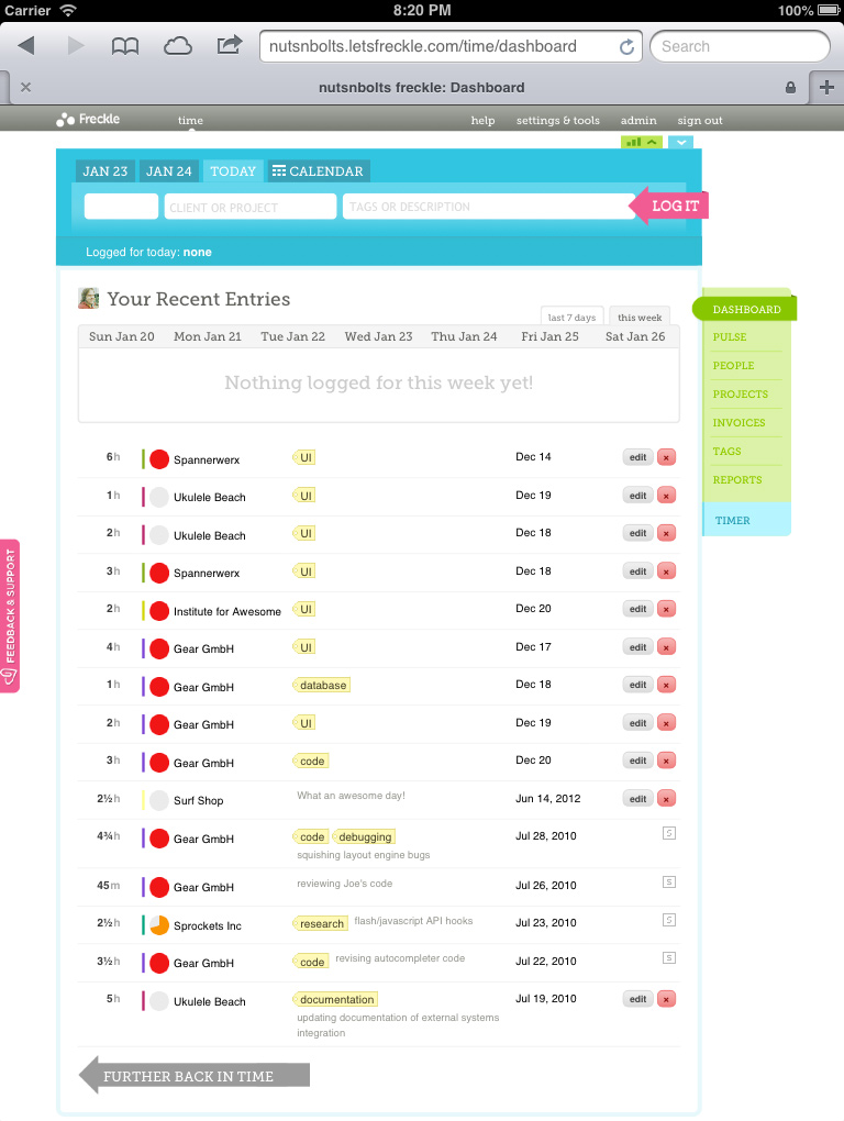
Here’s one way I solved this in Freckle Time Tracking:
- I use Zepto’s detect module to see if I’m on a tablet or phone (you can use this module independently of Zepto, it doesn’t have dependencies on it).
- If it’s a tablet or phone, I add a “no-hover” CSS class to the
BODY element
- I disable any
:hover styles with selectors that use body.no-hover .... You actually don’t have to redefine the :hover rule, just make sure the normal rule and the :hover rule contain the same CSS property settings (like visibility:visible)
Now, my reason for not feature-testing (sue me!) for support of touch events and instead using browser sniffing is that 1) historically detection of touch events has been unreliable, 2) there are hybrid browsers and devices that support both touch and normal mouse events, and 3) it’s faster.
Update Jan 26, 7:50pm ET: Here are two more variants on this, the first one is from Thijs van der Vossen, and is a short JavaScript snippet that you can inline in your HEAD element. It adds multiple classes to HTML, depending on the environment it’s run in. The second variation is a CoffeeScript function to automatically remove :hover rules from Mislav Marohnić (assumes a modern, properly DOM-compatible browser).
November 28th, 2012
There now is an abundance of devices with some sort of high-density display, from MacBook Pros to iPads, from Windows Surface tablets to all kinds of mobile phones.
All of these devices have one thing in common: In web browsers (that support the high-density screen correctly) one CSS pixel is not equal to a physical screen pixel.
In terms of CSS, to specifically target this group of devices, unfortunately there’s no easy way to say “apply this set of rules to all devices where physical pixels are not equal to CSS pixels”. Instead you have to fight through a whole forest of media query rules.
Here’s the set that I use on my sites:
@media (min--moz-device-pixel-ratio: 1.5),
       (-o-min-device-pixel-ratio: 3/2),
       (-webkit-min-device-pixel-ratio: 1.5),
       (min-device-pixel-ratio: 1.5),
       (min-resolution: 144dpi),
       (min-resolution: 1.5dppx) {

/* Retina rules! */

}
This is tested on all browsers I could get ahold of, on real Retina and non-retina displays, and should be future-proof as well. We use this specific query in production on Freckle Time Tracking (Sorry, marketing site is not retinafied yet!)—and it works well!
Specifically, it supports Safari, Chrome, Firefox (Note: Firefox doesn’t really support Retina screens at all yet) and Internet Explorer 9 and 10 (IE has great Retina support, actually!).*
I’d love to hear corrections and suggestions about this, please use the gist.
*Before you ask, I suppose it supports Opera as well, but I don’t test on Opera. It’s a long story.
Want to make your websites all ready for the smorgasbord of screen resolutions and densities? Fear not—my latest ebook
Retinafy your web sites & apps now will guide you through the jungle! Learn how to deal with all this in 30 minutes reading, and have your site all shiny by tomorrow!
November 26th, 2012
If you haven’t gotten around to make your web app or web site ready for high-density displays—now is the time to grab my ebook Retinafy your web sites & web apps for 30% off. Only today, Cyber Monday, November 26! Use code PIXELS! (Makes a great gift, too!)
November 22nd, 2012
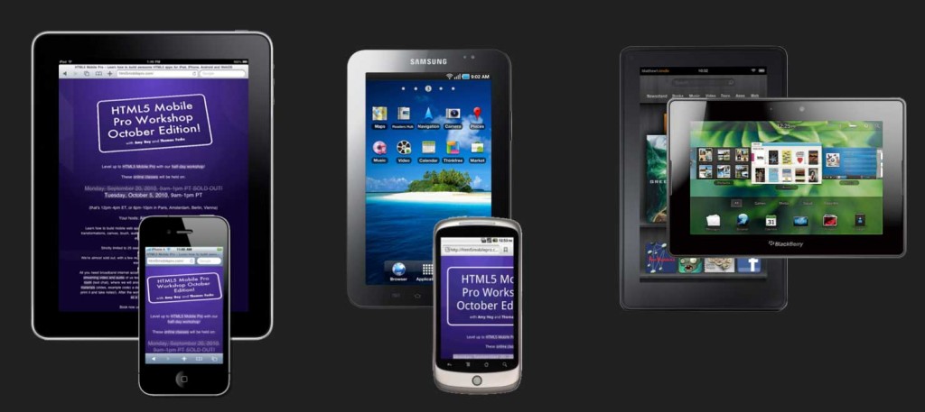
Instead of the stress of fighting for the deals at your local shopping center, why not lean back in your pyjamas and learn all about HTML5 Mobile pro development from the comfort of your home?
And even better, if you buy HTML5 Mobile Pro Desktop Edition until midnight on Friday, November 22, you get 55% off the regular price. Just use coupon code BLACKFRIDAY!
Happy Thanksgiving! 🙂
October 20th, 2012
Wondering what your “hourly rate” is when you go out and write a technical book? Traditionally, publishers will tell you that you do it for “exposure” but we all know that you can die from that. Seriously, even for the publisher it’s a big gamble, and with all the extra costs for printing, marketing, publishing, whole-sale prices, etc. there will be nothing left over for you. And “exposure” will not pay the bills.
There’s a much better approach: self-publishing and learning the basics of marketing to sell your book to the right audience. As an added bonus, you’ll know each and everyone of your readers and can build a strong relationship with them—which is awesome for you as you can fine-tune your book to reader’s needs and for your readers because they feel there’s an actual human being there listening to them.
To achieve this, you have to keep your costs low and your profit margin high. It’s no good to sell many copies with almost no profit, as the market for highly specialized books is limited.
Here’s my 5 rules to go for:
- (Rule #0: Have great content that is relevant to your target audience. That goes without saying!)
- Rule #1: No publishers. Publish the book yourself.
- Rule #2: No 3rd-party sales channels. No Amazon/Kindle, iBookstore, etc.
- Rule #3: No DRM. DRM has never stopped anyone from pirating stuff.
- Rule #4: Publish as a PDF. Optionally also as EPUB, depending on topic/audience. No dead-tree version, please.
- Rule #5: Price high. Price for the value you provide, not for what feels right.
No publishers obviously cuts out the middleman. Of course, you’ll have to learn how to market your book—you can’t just sit there and wait for people to come. You might say, “But Thomas, you have a billion followers on the interwebs, your stuff sells by itself!”—I’m hearing this all the time, but being “internet famous” (in a very small circle) isn’t going to sell your book. I have to work on getting the marketing right just as hard as anyone else does.
For ebooks like this, email lists work well. For people to trust their email address to a stranger (you), you’ll need to give them something useful in return—for example, a coupon code to get the book cheaper, free chapters or weekly tips and tricks. Email marketing done right is a bit of work, but it will pay for itself. And if you don’t market, you won’t sell. Additional things you should do is try to land interviews and guest blog posts on blogs relevant to your topic.
For Retinafy, I’ve built initial interest by giving away a Retinafying flowchart for free (the flowchart was downloaded almost 100,000 times), and I sent out approximately weekly emails to the list of people that signed up to be informed about the book, each with a little tidbit and reason why retinafying is important and necessary, why the book will make it super easy, and a quote from a reader (collect those!).
As for Rule #2—100% of the profits (after payment fees) will go to you. For some topics, 3rd-party sales channels work really well, but most highly specialized technical topics are not among those. (If you sell more than a 100 copies you’re selling more than most other self-publishing authors. But most of those authors fail to market right.)
Once you figure out the price (you need to set the price first, and remember to not base your price on what feels right, see #5), to be profitable and worth your time, you should calculate what you want your minimum hourly rate to be. For example, Retinafy took me about 50 hours of research and writing, and maybe another 30 hours of marketing. As of today, October 20 2012, I’ve sold 1088 copies, for a total sale amount of $22,393. For PayPal, you can assume that you’ll end up paying 5% or so in fees, so the profit so far is about $21,300, give or take a few. This makes my hourly rate when working on the book $266.25, and this is only going to increase with more sales.
Incidentally, looking at the hourly rate tells you how many copies you should target for—if the rate you project is below a certain number, it’s simply not worth writing the book. My lifetime-copies-sold goal of this particular book is 3,000 copies (at the current rate of sales, without additional marketing, I’ll reach this in a year or two, with an additional $50,000 coming in). For comparison, JavaScript Performance Rocks! a book Amy and I wrote in 2008, sold a total of 2686 copies so far, for a total amount of $79,964.96. (This is doesn’t include some site licenses we sold as well).
No DRM (rule #3) is a no-brainer. It makes it harder for you and for your readers, breaks things, is ugly and most importantly never stopped anyone from pirating. Don’t bother.
Now as for rule #4, depending on your audience and book topic, just a PDF is enough. For example, I sell Retinafy.me only as a PDF. Now some people will give you flak about that, but the book has a lot of illustrations, screenshots and tables that can’t be formatted in any sane way (meaning not weeks of work) with EPUB, so I choose to have a PDF only. If it’s not a book about design and UI issues in particular, you’ll probably want to publish as an EPUB. (I’ll try to write about the toolchain I use in an upcoming blogpost.)
And we come to the last, and probably most important rule, price high. Your readers get value out of your book. If someone works for an hourly rate of say $100, reading my Retinafy ebook will save them perhaps a full week of research, trying to read through blog posts, compiling information, running tests, trying things cross-browser, and so on. That’s $4000 spent on a book that costs $29. That’s less than 1% of the money you lose if you’d research it all yourself (and I’m an expert on this topic, so it will probably take you more than a week, and you wouldn’t be sure if you found the right answers). Never forget that your target audience is professionals. They spend money every day on things that are useful and provide value to them. $29 for an ebook that provides thousands of dollars in value to them is a no-brainer. (Heck, I should probably have priced it higher!)
Anyway, this how you can sell a book yourself, provide tremendous value to people—and make a tidy profit.
Oh, and now that you know how much money it will save you, grab a copy of Retinafy your web sites and apps! 🙂
P.S. Want to discuss? Here’s the hacker news thread.
October 8th, 2012
Here’s three things you can do easily to improve your low-density website or app for people on Retina screens:
- For photos, use high-resolution JPGs with low quality settings. Let the browser scale the image down on normal screens. Bonus: no increase in file size!
- Use the same high-res background images for both normal and retina. This works great if you don’t support IE before version 9 (like Google!)—just replace images used by
background-image with high-resolution versions and use background-size to scale them accordingly (works great with CSS sprites!)
- Create a proper Favicon. This will make your websites icon not look ugly in bookmarks and browser toolbars, and will only take a few minutes.
If you’re willing to spend a little more time, I’d highly recommend to look into replacing bitmapped images with CSS gradients and effects, and/or with SVG-based images. It’s more work, but it will pay off in faster loading times, less complex HTML and more flexibility to change designs and adapt them to new requirements (for example, if you decide to implement responsive design).
The devil is of course in the details—but there’s no need to research all this yourself (which likely takes weeks!), just grab a copy of my ebook about Retinafying your web sites and apps!
September 27th, 2012

It’s easy to confuse these, so here’s the gist:
The display resolution of a screen describes the total amount of pixels available in each dimension—for example, the original iPhone has a resolution of 320×480 and a 2012 27-inch iMac clocks in at 2560×1440. Some people use terms like “VGA” resolution for some of the more popular resolutions (VGA is 640×480). Don’t bother trying to memorize all of them, as there are too many screen sizes these days.
Pixel density, on the other hand, is how many pixels fit into a fixed amount a space, and is most often given as pixels per inch (ppi) or dots per inch (dpi). These units are the same and can be used interchangeably. For example, the original iPhone sports 163 ppi, while the 27-inch iMac has a density of 109 ppi. It follows that the iMac compared to the old iPhone has a much higher resolution but a much lower pixel density.
An other term used is “pixel ratio”, especially when dealing with high-density displays in JavaScript and CSS. The pixel ratio specifies how a physical display pixel compares to a pixel on a “normal” density screen. A “normal” display is anything between about 100 ppi (desktop, laptops) and 175 ppi (mobile), give or take. “Retina” displays are roughly 200 ppi and up, give or take.
So what is “Retina” exactly?
Glad that you ask. First off, “Retina” is a marketing term Apple uses to say something is “high-density”, but for the sake of simplicity I’m liberally applying this term to anything that’s not a “normal” density, or more specifically any display where, by default, one CSS pixel is larger than one physical screen pixel.
A screen that is, in Apple-speak, called a “Retina” screen has twice the pixel density of a “normal” screen with the same physical size. That’s four times as many pixels. There’s also some in-between densities on some Android phones, for example the Google Nexus One phone has a 1.5× higher pixel density than a “normal” phone. This is equal to slightly more than 2× as many pixels. In Android-lingo, that’s called a “high DPI” phone.
Read on in my ebook! 🙂
Want to make your websites all ready for the smorgasbord of screen resolutions and densities? Fear not—my latest ebook
Retinafy your web sites & apps now will guide you through the jungle! Learn how to deal with all this in 30 minutes reading, and have your site all shiny by tomorrow!
September 22nd, 2012
There’s a bunch of JavaScript helper libraries around to make your site “ready for retina”, and it’s tempting to think that there’s an easy solution that only loads in retina images when required. However, as I’ve laid out it’s better to think “retina-first”, and assume you’re running on a retina screen and make exceptions or adaptions for “normal” screens, as high-density displays will soon be the norm rather than a special thing (and they are the norm on mobile devices already!).
tl;dr—don’t use JavaScript “retina” helper libraries
Combined with the extra overhead of loading in a “retina” JavaScript library, parsing and replacing items in the DOM (which causes expensive layout reflows and re-rendering) and of course downloading extra versions of page assets (depending on the library up to 3 total HTTP requests have to be made for each image!) it quickly becomes clear that there’s no quick and easy “silver bullet” JavaScript solution.
Just design “retina-first”, use SVG and modern CSS whenever possible and for bitmapped images, go high-resolution and let the browser scale down. Make exceptions when you have to.
Like this little tip? This is an excerpt from my ebook
Retinafy your web sites & apps. Grab your copy now and have your web sites and apps retinafied in no time—avoid pitfalls like JavaScript libraries that do more damage than good and learn all the other tricks!
![]()


