More than meets the eye
June 14th, 2012Since the announcement of the MacBook Pro with Retina screen, everybody seems to be busy making Retina versions of their sites and apps. Before you @2x everything, let’s take a step back and look at the big picture (*rimshot*). Here are the screen densities of some more or less current Apple products and a current Android phone:
- iMac 27″ 109dpi
- MacBook Pro 13″ 113dpi
- MacBook Pro 15″ Hi-Res 128dpi
- iPad 2 132dpi
- MacBook Air 11″ 135dpi
- MacBook Pro 15″ Retina 220dpi
- New iPad 264dpi
- Galaxy Nexus 316dpi
- iPhone 4 326dpi
What’s not included here is that on the MacBook Pro with the Retina screen you can choose a virtual resolution, and the screen is scaled accordingly.
These virtual resolutions are (afaik) achieved by rendering at twice the virtual resolution and scaling the resulting picture to 2880×1800 (the native resolution of the MacBook Pro’s screen). Let’s have a look at the settings:
- 1024×640: rendered at 2048×1280, ~156dpi
- 1280 x 800: rendered at 2560×1600, ~195dpi
- 1440 x 900: rendered at 2880×1800, 220dpi (native)
- 1680 x 1050: rendered at 3360×2100, ~257dpi
- 1920 x 1200: rendered at 3840×2400, ~293dpi
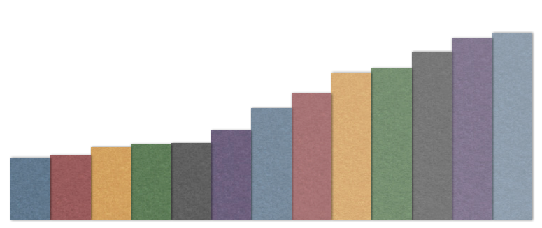
The point is, that if you take all these pixel densities there’s a pretty linear spread. “Just have one normal version and a scaled-by-two version” is just not enough. And this is not only true for Macs and mobile devices, Windows 8 will run at 1x, 1.4x, and 1.8x scaling modes (/ht @thijs).
Plus, on mobile devices people zoom into (and out of) website content all the time and this will likely become the norm on desktop computers, too (Safari already has full support for gesture-based zooming). And there’s the topic of accessibility.
My advice: better do away with ALL raster graphics for your web app or site, and switch to use vector-based artwork (SVG!), possibly custom fonts and of course other CSS3 features where possible. For photos and images, use hi-resolution JPEGs and spend time on optimizing the quality settings.
Tweet


