
The long search for a terminal font is over
October 12th, 2010I’ve looked at and used lots of fonts for programing and the command line over the years, but none ever really seemed quite right. I had a long love affair with ProFont, but unfortunately, the font has some issues such as swallowing up the sequence “l/” in Terminal.app.
But fear not, Apple bundled Menlo, a derivative of Bitstream Vera Sans Mono, with OS X 10.6 and the world of the command-line suddenly looked a lot brighter. What a nice font!
However, there are two problems I have with Menlo:

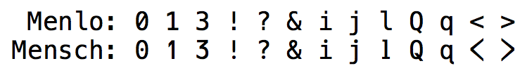
First, the shape of the number zero “0” just isn’t right. I like my zeros dotted, not dashed:
“The zero with a dot in the center is the most common variation today. It seems to have originated as an option on IBM 3270 controllers. The dotted zero may appear similar to the Greek letter theta (particularly capital theta, Θ), but the two have different glyphs. In raster fonts, the theta usually has a horizontal line connecting, or nearly touching, the sides of an O; while the dotted zero simply has a dot in the middle.” – Wikipedia’s slashed zero article
Luckily, Robey Pointer released Mensch, a derivative of Menlo (so a derivative-derivative, hooray for open-source fonts!), which fixes that problem. Unfortunately, Robey also messed with various glyphs, most importantly the 1 and l, and the angle brackets, which is just to invasive for me.
My second gripe is line-height. If you use Menlo in Terminal.app, everything gets squished together, and there’s no setting to change that (actually, in Terminal.app there is; however not with other apps like MacVim).

Back to the drawing boards, Andre Berg released Meslo, another Menlo customization (image credits for above image go to Andre).
Meslo comes with a selection of line-height tweaks, and I decided on the M variety. It’s amazing. Only thing missing is the dotted 0.
I decided to ask Andre if he can add it (GitHub is social coding, after all. And social fonting, I suppose!) — and… to my surprise he did instantly! Thanks so much for that!

I now use Meslo LG DZ M at 13pt in both Terminal.app and MacVim. I’m finally in love with a programming and terminal font. Awesome!
If you like it too, you can download Meslo LG DZ here.
Tweet

